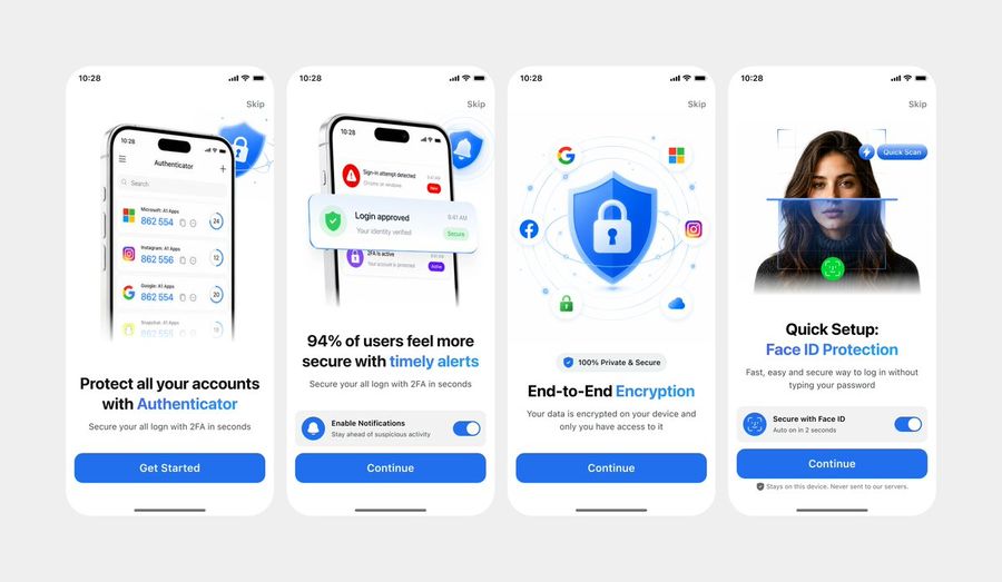
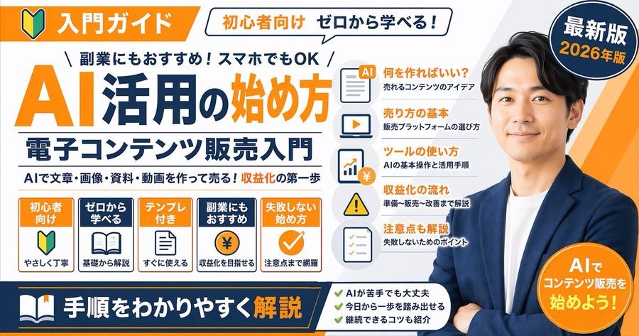
Authenticator Onboarding Ui
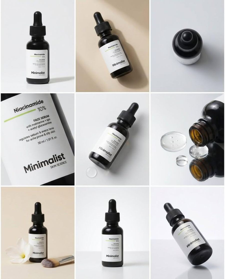
What this prompt does: Produces a product photography image using GPT Image 2. Style cues: dark, minimalist. Sourced from a verified fair-citation repository (Soumyadip) and reproduced here unchanged with full attribution per the source license.
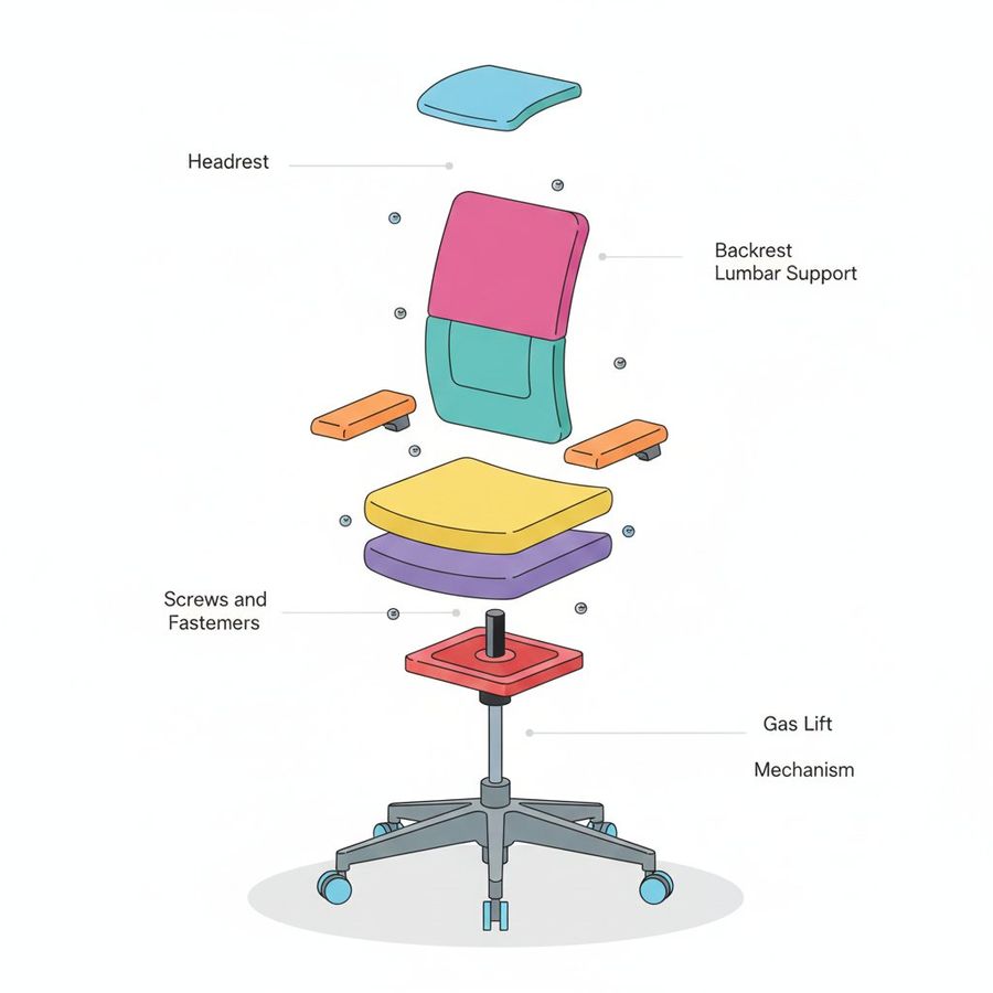
Using REFERENCE_1 as the primary UI reference and REFERENCE_0 only for the darker variant details if needed, recreate the mobile onboarding flow as a clean, front-facing design mockup instead of a photographed laptop screen. Extract and straighten the four iPhone-style screens, remove all camera perspective, glare, browser chrome, laptop edges, and surrounding environment, and place the screens evenly spaced on a light gray canvas. Keep the same white/light theme, rounded phone cards, blue security branding, typography hierarchy, icons, illustrations, and CTA style. Produce exactly 4 onboarding screens from left to right: 1) authenticator accounts list with headline “Protect all your accounts with Authenticator” and CTA “Get Started”; 2) security alert notifications with headline “94% of users feel more secure with timely alerts” and CTA “Continue”; 3) shield/lock encryption illustration with headline “End-to-End Encryption” and CTA “Continue”; 4) Face ID quick setup with the portrait/scan graphic, headline “Quick Setup: Face ID Protection”, secure Face ID toggle card, small privacy note, and CTA “Continue”. Use {argument name="primary color" default="bright blue"} as the main accent color, keep the app name as {argument name="app name" default="Authenticator"}, and keep the status time as {argument name="status time" default="10:28"}. Make the result look like a polished Figma export/product presentation, crisp and high resolution, with no real-world photo artifacts.
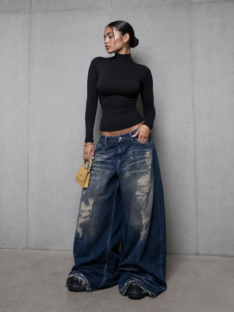


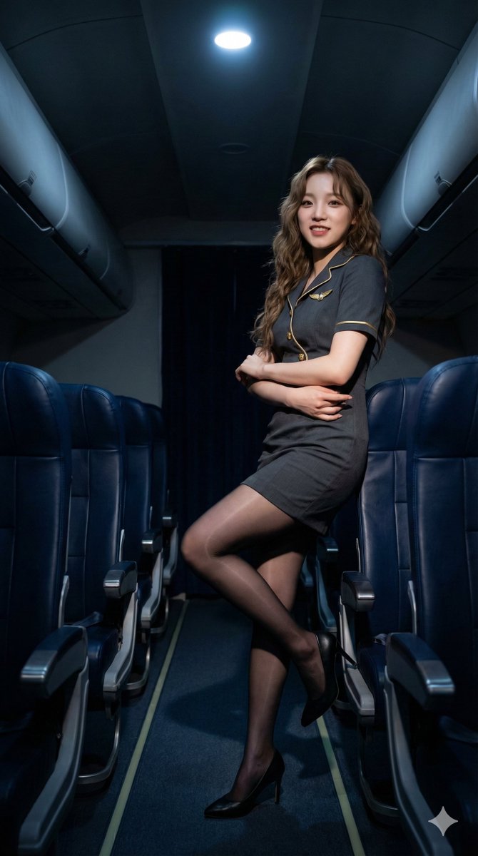

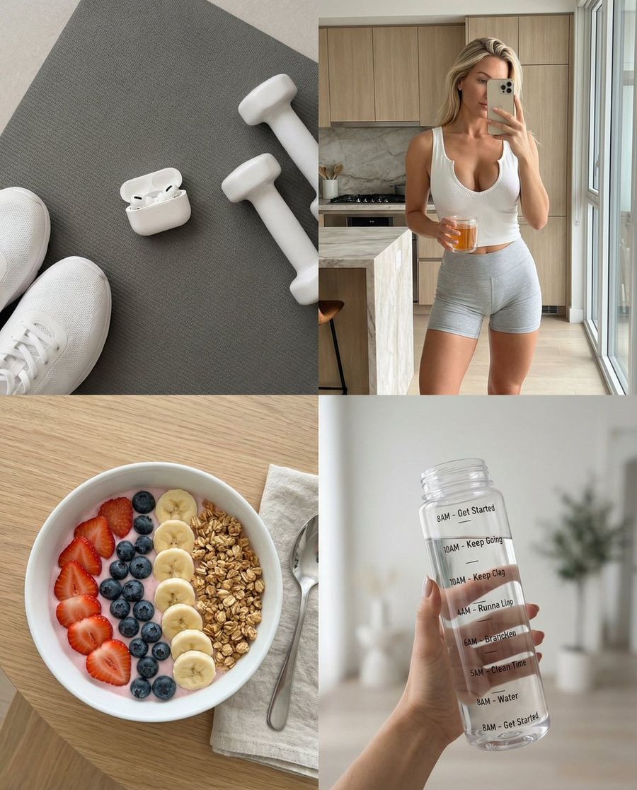

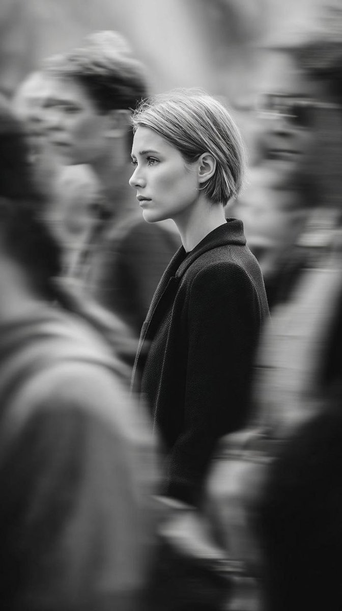
![Color / Feature] in Minimalist Room, Late Afternoon Sun Streaming — Nano Banana Pro image prompt example](https://pub-c5e3d660d0a241c5895facb8ff762e97.r2.dev/media/youmind/nano-banana-pro-5006.jpg)
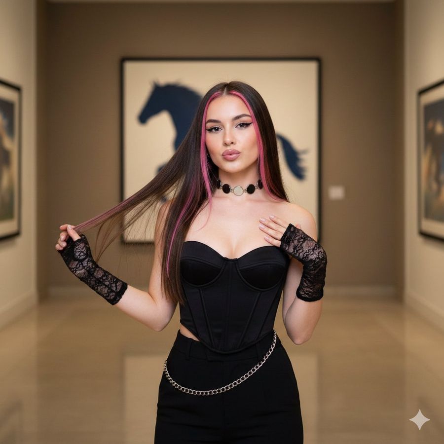
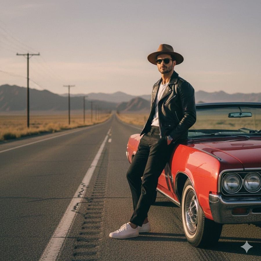
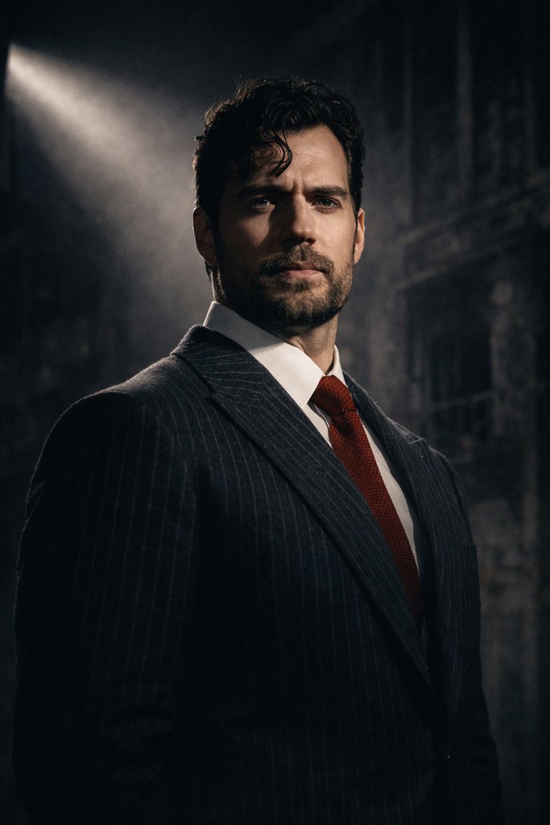
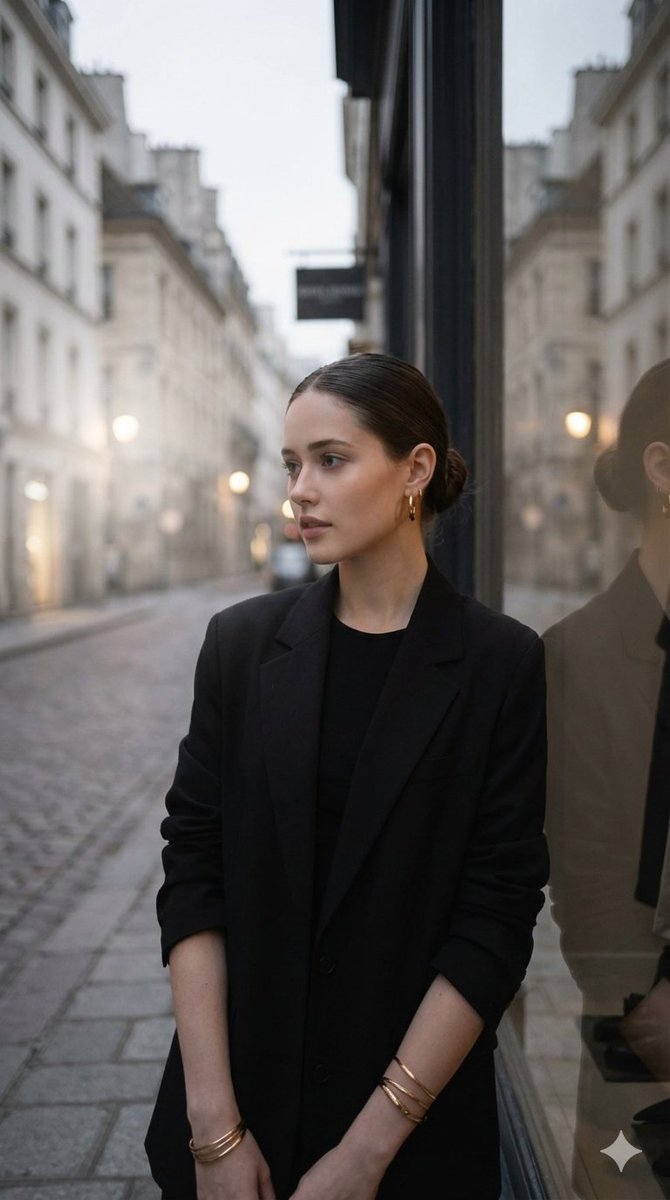
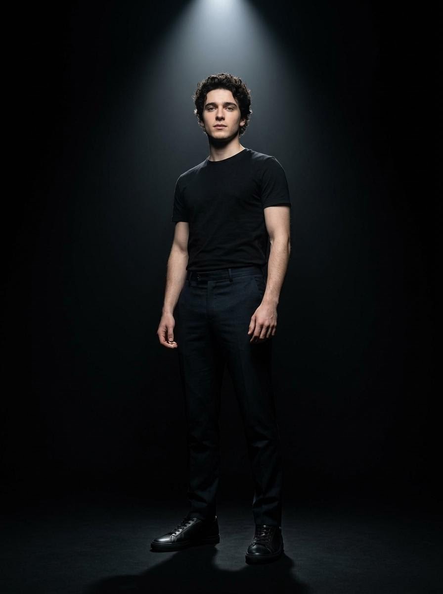
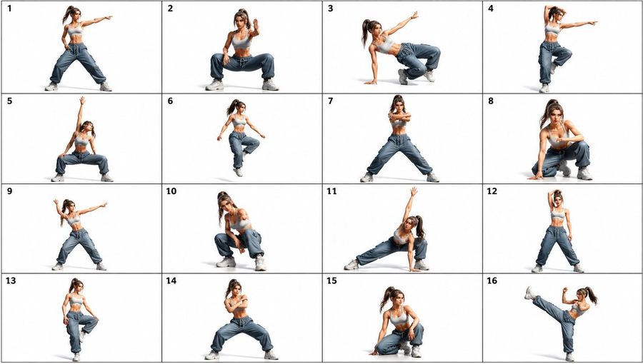
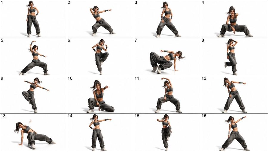
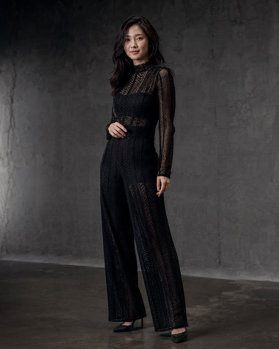
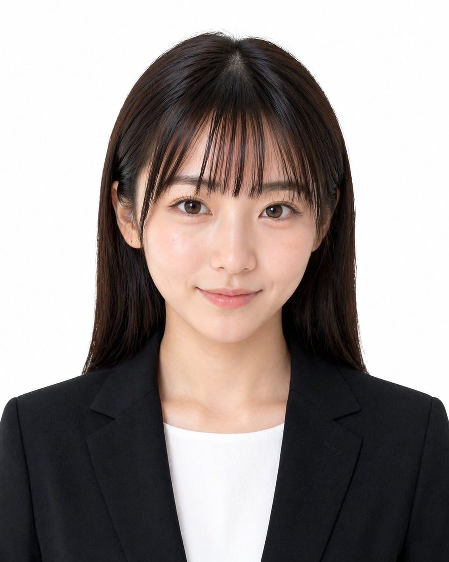
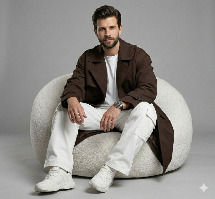
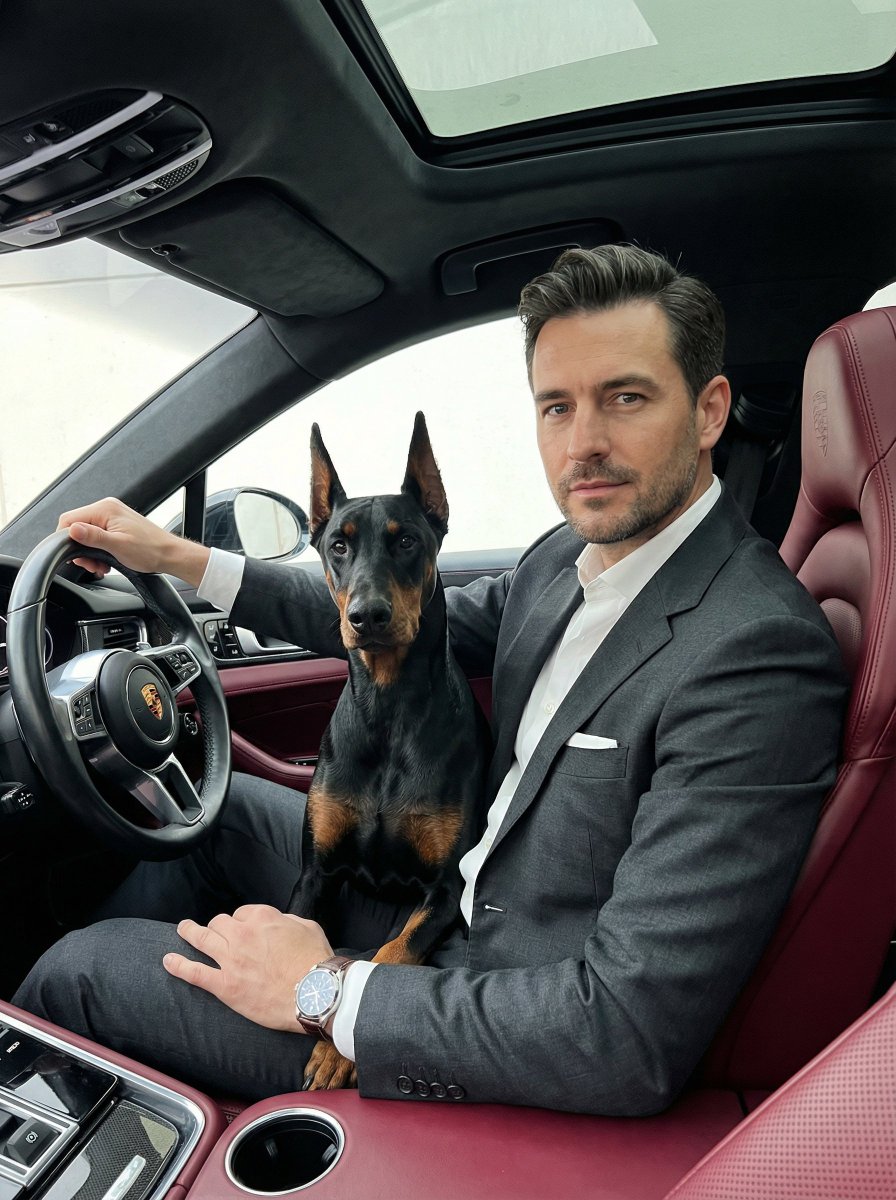
![Ultra-realistic 8K Full Body Portrait of \[PERSON’S FULL NAME\] — Nano Banana Pro image prompt example](https://pub-c5e3d660d0a241c5895facb8ff762e97.r2.dev/media/youmind/nano-banana-pro-7319.jpg)