Pc To Smartphone Web Design Conversion Prompt For Nano Banana Pro
What this prompt does: Produces a anime illustration image using Nano Banana Pro. Style cues: cinematic, dramatic. Sourced from a verified fair-citation repository (まさた|Web制作) and reproduced here unchanged with full attribution per the source license.
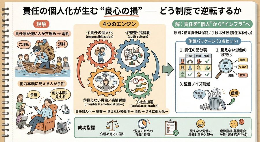
# Instruction
You are a skilled UI designer.
Analyze the attached image of a "section of a PC web design" and generate the optimal layout image for that part when displayed on a smartphone (SP) screen.

# Generation Rules (Section Specific)
1. Process as an independent component:
- Do not add any headers, footers, or unnecessary navigation bars.
- Reconfigure using only the elements present in the image (text, icons, photos).

2. Responsive Layout Conversion (Stacking):
- Elements that are horizontally aligned on the PC (Horizontal row) should be changed to vertical stacking (Vertical column) for the smartphone.
- Margins (Padding/Margin) should be appropriately adjusted for the narrow screen width of a smartphone.

3. Design Inheritance:
- Maintain the color scheme, font atmosphere, and decorative style of the original image.
- The image aspect ratio should be generated as vertical (e.g., {argument name="aspect ratio" default="3:4 or 9:16"}), assuming the elements will be stacked vertically.

# Action
Generate one design comp of the attached image section, optimized for smartphone screen width (375px~).


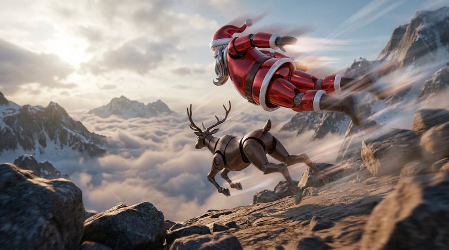
![This Image [Add Image] in a 3D Hyper-realistic Style with Modern — Nano Banana Pro image prompt example](https://pub-c5e3d660d0a241c5895facb8ff762e97.r2.dev/media/youmind/nano-banana-pro-11741.jpg)
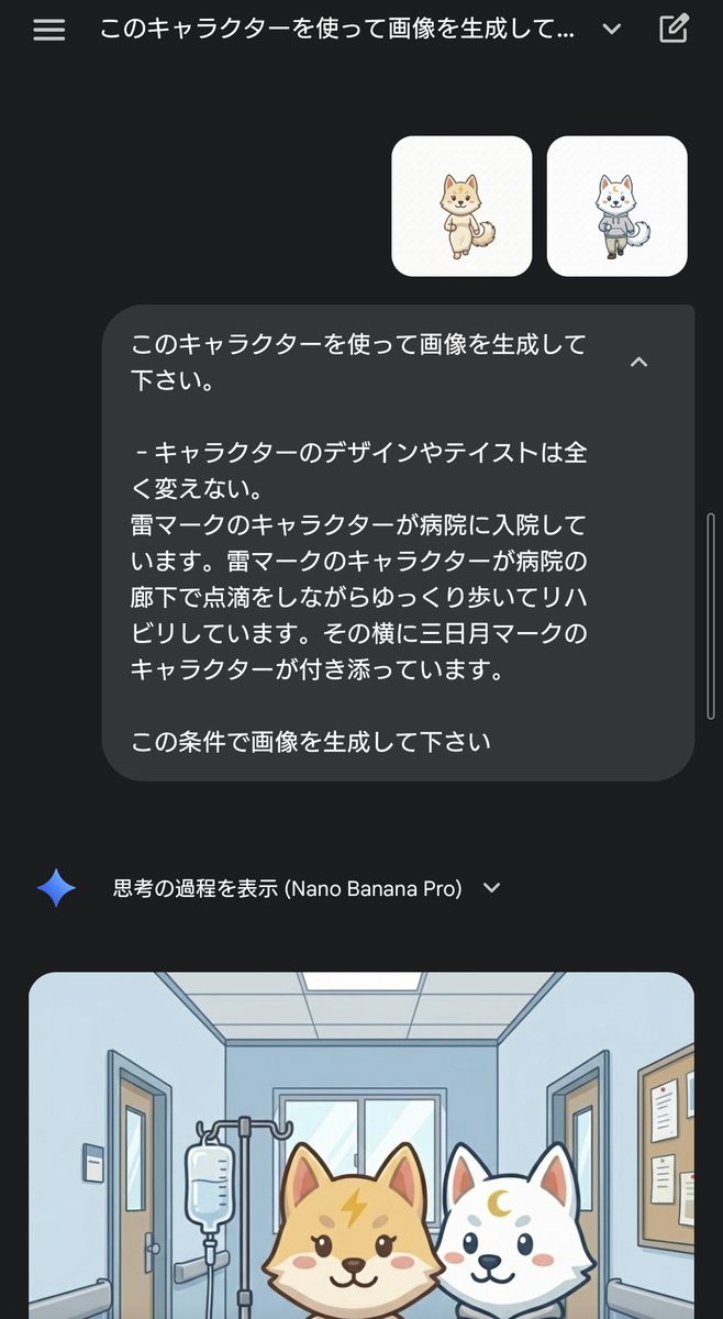
![Instruction> Do This for [Animal / Creature / Pet] Practicing — Nano Banana Pro image prompt example](https://pub-c5e3d660d0a241c5895facb8ff762e97.r2.dev/media/youmind/nano-banana-pro-11862.jpg)
![PRODUCT TYPE] (Clothing / Food / Automotive / Tech) — Nano Banana Pro image prompt example](https://pub-c5e3d660d0a241c5895facb8ff762e97.r2.dev/media/youmind/nano-banana-pro-11899.jpg)

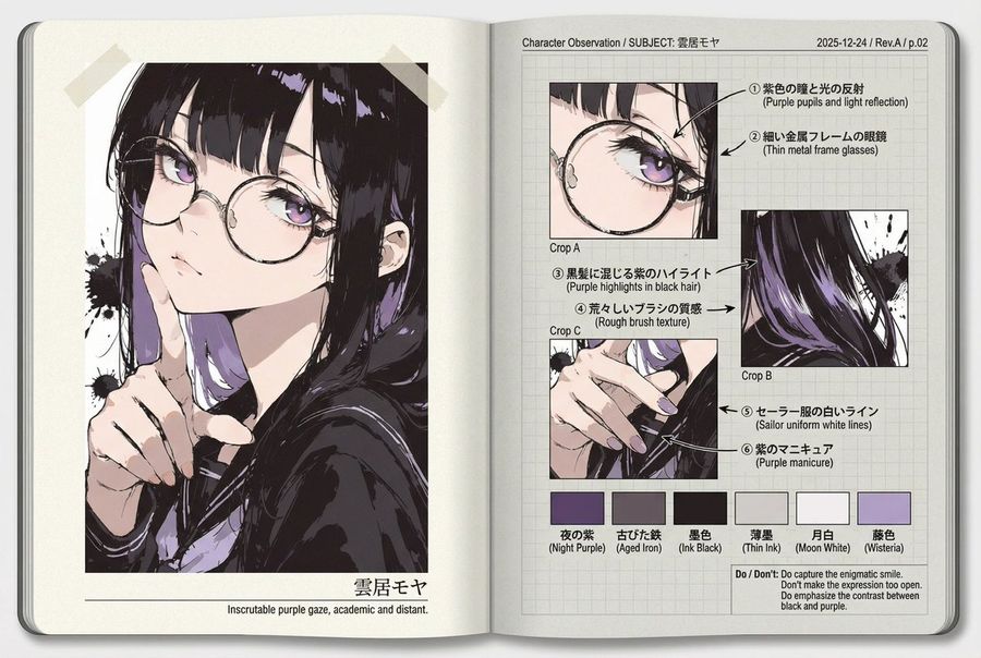
![Use the Character Turnaround Format from [img1] to Create [Character — Nano Banana Pro image prompt example](https://pub-c5e3d660d0a241c5895facb8ff762e97.r2.dev/media/youmind/nano-banana-pro-12639.jpg)
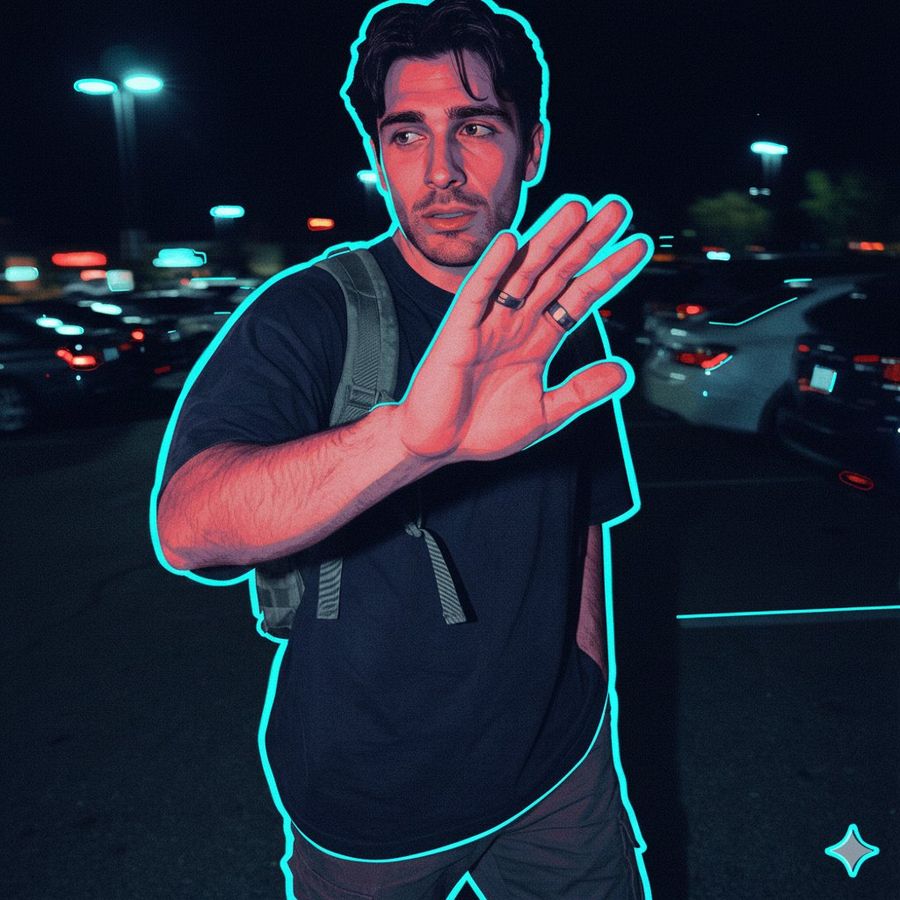
![Hyper-realistic Photo of the [Reference Woman] Peeking Out — Nano Banana Pro image prompt example](https://pub-c5e3d660d0a241c5895facb8ff762e97.r2.dev/media/youmind/nano-banana-pro-2762.jpg)
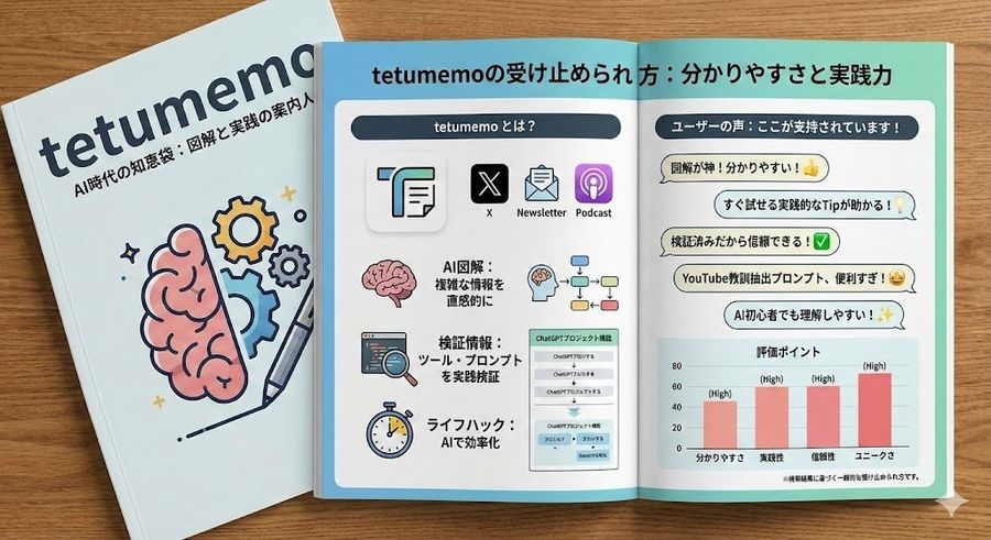
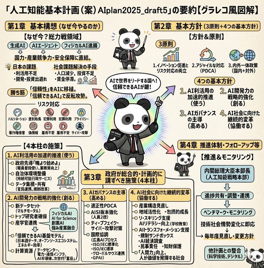
![Xxxxx, Please Generate an Infographic, Using the Style [Xxxx] — Nano Banana Pro image prompt example](https://pub-c5e3d660d0a241c5895facb8ff762e97.r2.dev/media/youmind/nano-banana-pro-2979.jpg)
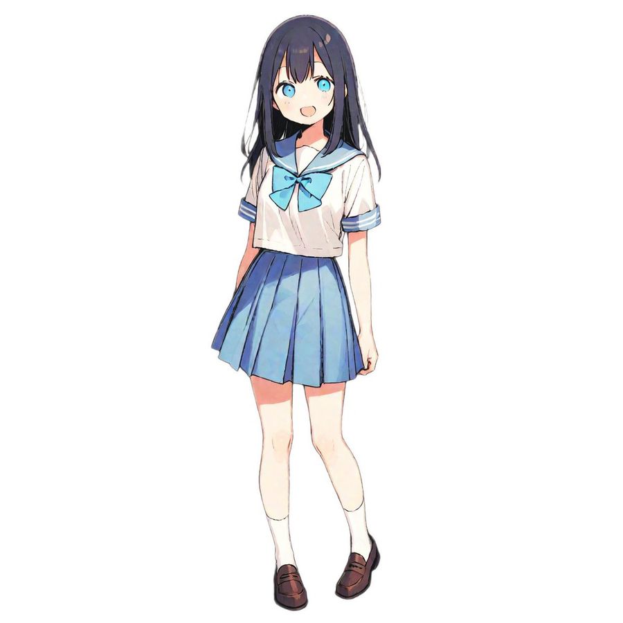
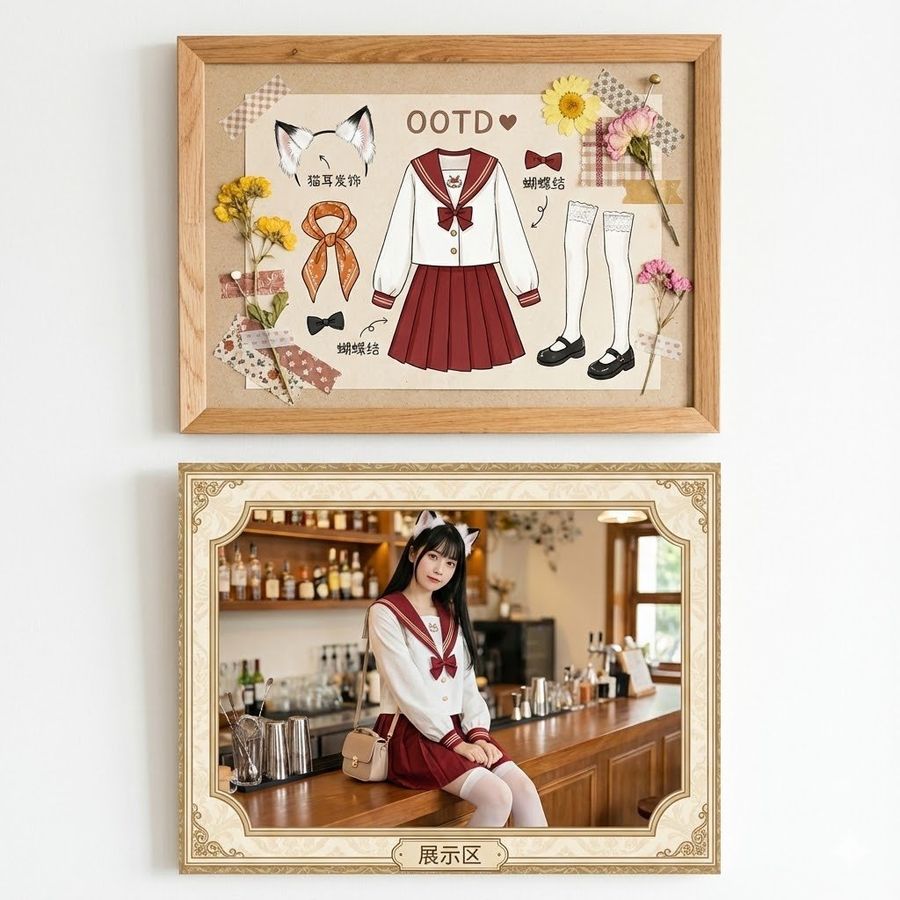
![Female Outfit Name]: Sailor Uniform — Nano Banana Pro image prompt example](https://pub-c5e3d660d0a241c5895facb8ff762e97.r2.dev/media/youmind/nano-banana-pro-3137.jpg)